BookAir
“Good design doesn’t just make booking easier — it makes people feel in control of their journey.”
Overview:
A modern flight booking application designed to simplify the process of searching, booking, and confirming flights — all within a seamless, intuitive interface. The app allows users to explore flight options, view each step of the booking journey, and receive instant confirmation updates.
Key Features:
🧭 Guided Booking Flow: Step-by-step navigation from flight selection to final confirmation.
💳 Smart Checkout: Simplified payment interface and clear fare breakdown.
🤖 Discover AI: A built-in AI travel assistant that helps users brainstorm and organize trip ideas, destinations, and itineraries.
📱 Interactive Prototype: View the full user experience — from browsing to booking — in an interactive flow.
Live Prototype:
View App on Figma →
Tools Used: Figma, FigJam, Auto Layout, Interactive Components
Low-Fidelity Wireframes
🧩 1. Early Wireframes — Simplifying a Complex Flow
Goal: Define a seamless booking experience without overwhelming the user.
Process:
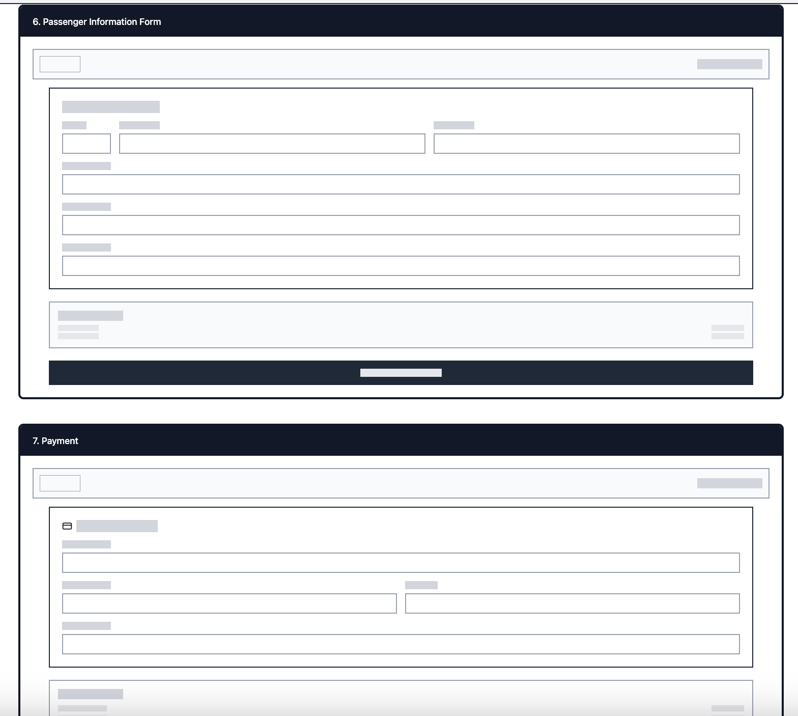
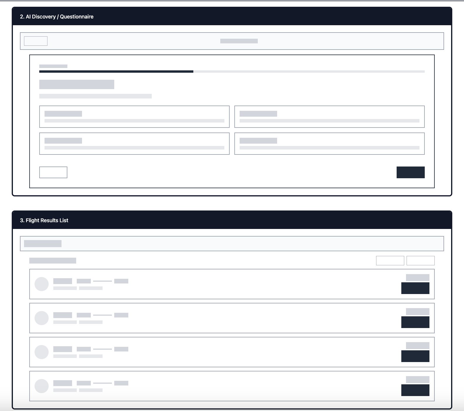
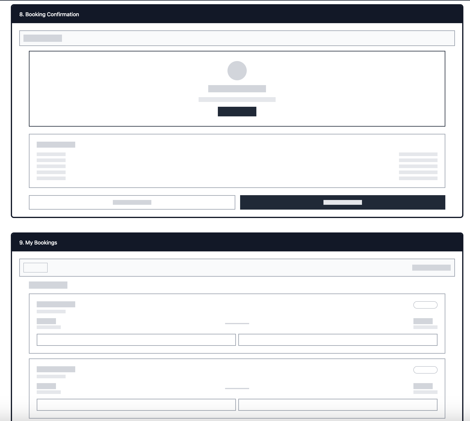
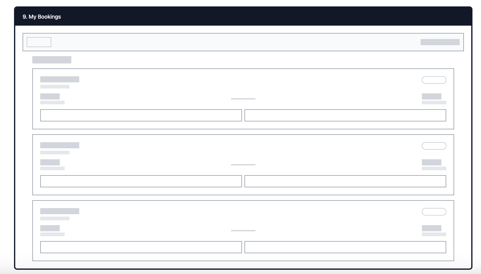
Started with low-fidelity sketches to map the full journey (Search → Compare → Select → Checkout → Confirmation).
Focused on reducing steps and creating a clear visual hierarchy.
Each screen had a single primary action to minimize confusion.
Design Rationale:
Users in testing said they often “got lost mid-way.” The first iteration therefore emphasized step-by-step progression with visible breadcrumbs.
🔁 2. Mid-Fidelity Iteration — Improving ReadabilityGoal: Increase clarity in how flight details and prices were presented.
Iterations Based On Feedback:Replaced long text lists with modular “flight cards.”
Added clear labels for baggage included, refund policy, and seat type.
Introduced accent color cues for “best value” and “fastest route.”
Design Rationale:
This version was directly influenced by interview feedback: “I can’t tell which flight includes what until the end.”
🎨 3. Visual Design System — Establishing BookAir’s BrandGoal: Create a trustworthy, modern, and aspirational visual identity.
Decisions:Color palette: Calm blues + whites for trust and air travel association.
Typography: Inter + Poppins for balance of professionalism and friendliness.
Icons: Rounded, lightweight icons for consistency across devices.
Spacing: Generous whitespace to reduce cognitive load and enhance readability.
Design Rationale:
The visual style mirrors the clarity found in financial dashboards (inspired by my J.P. Morgan work) but tailored to travel — clean, informative, and intuitive.
4. High-Fidelity Prototypes — Refining InteractionsGoal: Test how users interact with transitions, confirmation feedback, and Explore AI.
Iterations Based On Feedback:Added an animated progress indicator to reduce uncertainty.
Improved Explore AI cards to visually display destination + price.
Integrated auto-fill and smart suggestions to shorten booking time.
Enhanced confirmation screen with visual ticket and QR code.
Design Rationale:
Testing showed that micro-interactions (like a “ticket slide-in” on confirmation) made users feel more confident their booking succeeded.
✈️ Research & User Insights
🎯 Goal
To understand how people currently search, compare, and book flights online — and identify pain points that prevent a smooth, confident booking experience.
👥 User Interviews
I conducted six remote interviews with participants who travel at least twice a year, ranging from casual travelers to frequent flyers. The goal was to learn about their habits, frustrations, and emotional triggers when booking flights.
Sample Questions:
“What’s the hardest part about booking a flight online?”
“How do you usually compare flights or decide which one to book?”
“What makes you feel confident that you got a good deal?”
“Have you ever abandoned a booking midway? Why?”
“What would make the booking experience faster or less stressful?”
Key Quotes:
“I hate when the price jumps after I click — I never know what’s real.”
“I wish I could see flight and hotel options together instead of switching tabs.”
“Half the time I just get lost in filters — I can’t tell which flight includes baggage.”
“I’m scared I’ll book the wrong date, so I recheck everything five times.”
💡 Key Findings
From the interviews and competitive analysis, five consistent pain points emerged:
Hidden Fees & Lack of Transparency
Users often felt tricked by fluctuating prices or unclear baggage policies.Opportunity: Display fare breakdowns clearly and early in the process.
Decision Fatigue
Too many flight options caused cognitive overload.Opportunity: Simplify comparison through visual cues, filters, and smart sorting.
Trust & Confirmation Anxiety
Many users lacked confidence their booking went through or included everything.Opportunity: Add confirmation summaries, progress indicators, and micro-feedback.
Inspiration Before Booking
About half the users didn’t know where they wanted to go yet — they wanted inspiration, deals, or flexible trip ideas first.Opportunity: Create an “Explore AI” feature that recommends destinations based on budget, weather, or travel history.
Disjointed Experience Across Devices
Travelers often switched between phone and laptop; context didn’t carry over.Opportunity: Design a responsive, synced interface for multi-device continuity.
🧭 Personas
To translate these insights into design goals, I created two primary personas that reflect the spectrum of BookAir’s audience:
1. Sophia — The Occasional Explorer
35, marketing professional, travels for leisure 2–3 times a year
Values clarity, inspiration, and affordability
Frustrations: Hidden fees, too many tabs open, confusing filters
Goals: Find a trip idea fast, see honest prices, and book with confidence
2. Malik — The Business Traveler
42, consultant, travels monthly for work
Values speed, reliability, and flexible change options
Frustrations: Repetitive data entry, rechecking confirmations, juggling multiple devices
Goals: Rebook easily, save preferences, get real-time notifications
🔍 Research SynthesisAfter mapping each persona’s journey, it became clear that most users hit friction between search and checkout. This was the highest drop-off point. Users lost trust due to unclear fare differences and complex steps.
I synthesized findings into three main design priorities:
Transparency – Show users exactly what they’re paying for and why.
Clarity – Guide them step-by-step with clear progress states and minimal visual noise.
Assistance – Offer AI-based guidance (Explore AI, price prediction, and deal suggestions).
🧩 How Research Shaped the Design
The Explore AI feature was added after seeing users seek travel inspiration before booking.
The multi-step progress bar came from the need to reduce booking anxiety.
The smart fare cards (showing baggage, refund policy, and perks upfront) addressed hidden fee frustration.
A clean dashboard view was designed to reflect the “trustworthy data display” principles I use at J.P. Morgan — simplified, data-dense, but never overwhelming.
🌍 Why BookAir Is Worth Designing & Building
✈️ 1. Because existing travel apps still overwhelm instead of assist
Most flight-booking platforms (Expedia, Skyscanner, Google Flights) focus on showing more options, not guiding better decisions.
BookAir flips that — instead of presenting endless lists, it uses AI-driven assistance to help travelers discover and book flights that match their intent, not just filters.
💡 BookAir acts like a co-pilot — simplifying complex travel decisions through intelligent, contextual design.
🤖 2. Because travelers want guidance, not just data
Booking a trip is emotionally charged — it’s about excitement, stress, budget, and trust. Current tools solve the functional side but ignore the human side.
BookAir introduces Explore AI, an intelligent feature that:
Recommends destinations based on mood, time off, and budget
Predicts price trends to help users book confidently
Gives transparent cost breakdowns upfront
This makes travel inspired, personal, and anxiety-free — three things missing from most existing booking flows.
🧭 3. Because transparency = trust (and loyalty)
Hidden fees, fluctuating fares, and unclear refund policies are top reasons travelers abandon bookings.
BookAir fixes this by emphasizing price clarity at every step, including:
Real-time fee breakdowns
Visual “fare comparison” cards
Progress indicators to show users where they are in the process
Trust is the new currency in digital travel — and BookAir designs for it.
📊 4. Because it bridges two worlds — finance UX clarity meets travel UX emotion
BookAir draws inspiration from financial dashboards (like my work at J.P. Morgan), where data must be digestible, transparent, and fast.
Applying that same design rigor to the travel industry makes complex travel data (pricing, connections, loyalty, baggage rules) feel effortless and elegant.
“If users can understand a multi-account dashboard at a glance, they should also be able to book a complex trip with equal confidence.”
🌐 5. Because travel is shifting toward personalization & predictive design
Airlines and travel companies are investing heavily in AI and data ecosystems that personalize the user journey — from planning to boarding.
BookAir fits right into that next-generation ecosystem by combining:
Predictive insights (e.g., “Flights to Lisbon are 20% cheaper next week”)
User preference learning (e.g., always showing morning flights or preferred airlines)
Unified dashboard for managing trips, payments, and loyalty rewards in one place
This isn’t just a booking website — it’s a personal travel platform.
🪄 6. Because it makes travel feel effortless again
At its heart, BookAir’s design philosophy is simple:
“Book less. Experience more.”
By removing friction, offering clarity, and personalizing choices, BookAir transforms travel from a stressful transaction into an inspiring experience.


